
The City of Santa Monica looks at the Big Blue Bus system as a vital transportation lifeline for students, workers, seniors, and environmentally conscious residents. The challenge was to design an integrated digital experience for accessing real-time route information and trip planning tools that meets the needs of its diverse ridership.
The proposed microsite aimed to deliver a seamless mobile experience, improve route personalization and alerts, strengthen accessibility/inclusivity, enhance multimodal trip planning, support community engagement and leverage open transit data for innovation.
Through interviews with participants, clients and stakeholders, we gathered valuable insights to better understand and empathize with the needs of our target audience. This allowed us to dive deeper into defining the project's challenges.

Working Parent & Lifelong Resident
Name: Maria
Age: 39
Occupation: Medical assistant
Household: Single mother with 2 school-aged children
Tech Comfort: Mobile-first; moderate digital fluency
Needs:
• Real-time bus arrival info for Routes 7 and Rapid 10
• Easy trip planning between home, work, and kids' schools
• Spanish-language interface and voice accessibility options
Pain Points:
• Struggles to find live updates when buses are delayed
• Wants a mobile-friendly, one-tap way to favorite routes
• Needs reminders for service changes or detours

Student & First-Time Renter
Name: Jordan. Age: 22
Occupation: Santa Monica College student, part-time barista
Household: Lives with roommates in shared apartment
Tech Comfort: Highly tech-savvy; uses search
Needs:
• Route lookup by stop or landmark
• Estimated arrival countdown in real-time
• Notifications for missed buses and alternatives
Pain Points:
• Annoyed by delays or unclear reroutes
• Wants the site to sync with his calendar
• Prefers a modern, minimal UI with maps and icons

Retired Senior Citizen
Name: Eleanor
Age: 74
Occupation: Retired public school teacher
Household: Lives alone in a rent-controlled apartment
Tech Use: Uses desktop mostly; needs accessible content
Needs:
• Large, easy-to-read interface with high contrast
• Voice-assisted or screen-reader support
• Route info with fewer clicks and step-by-step directions
Pain Points:
• Confused by symbols or inconsistent route names
• Wants alerts for schedule changes she may miss
• Would benefit from a printable schedule view

Small Business Owner
Name: Andre
Age: 47
Occupation: Owner of a local juice bar
Household: Lives with partner and teenage daughter
Tech Comfort: Prefers desktop/tablet for business tasks
Needs:
• Map-based live view of buses around his storefront
• Service update notifications for downtown Santa Monica
• Data insights or summary for traffic trends affecting business hours
Pain Points:
• No quick dashboard for frequent route intersections
• Needs alerts tied to business zones
• Wants smoother integration with Google or Apple Maps
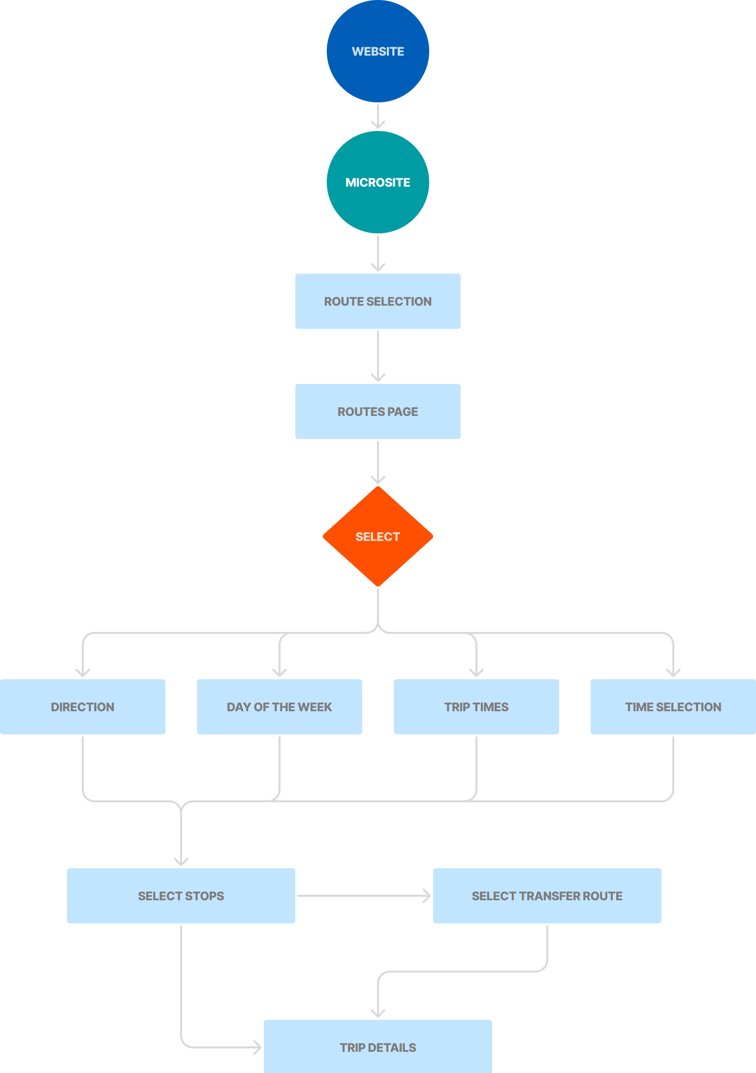
The team at SCPXL went through the process of rapidly visualizing, testing and refining thoughts and ideas before the development process. Below is a glimpse of how we defined the vision of the user's journey throughout the experience by highlighting decision points, loops and any potential friction areas.
To help the team determine the priority of information, I designed the placement and layout of content in wireframe form which allowed for rapid iteration, feedback and discussions.
Once approved, I developed the wireframes into a working prototype to help simulate user interaction with the product and address any potential pain points discovered throughout the early stages.

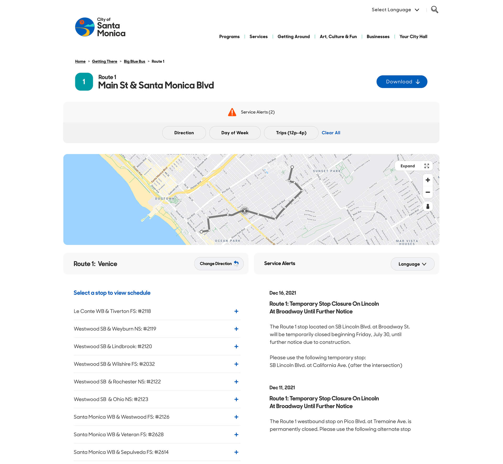
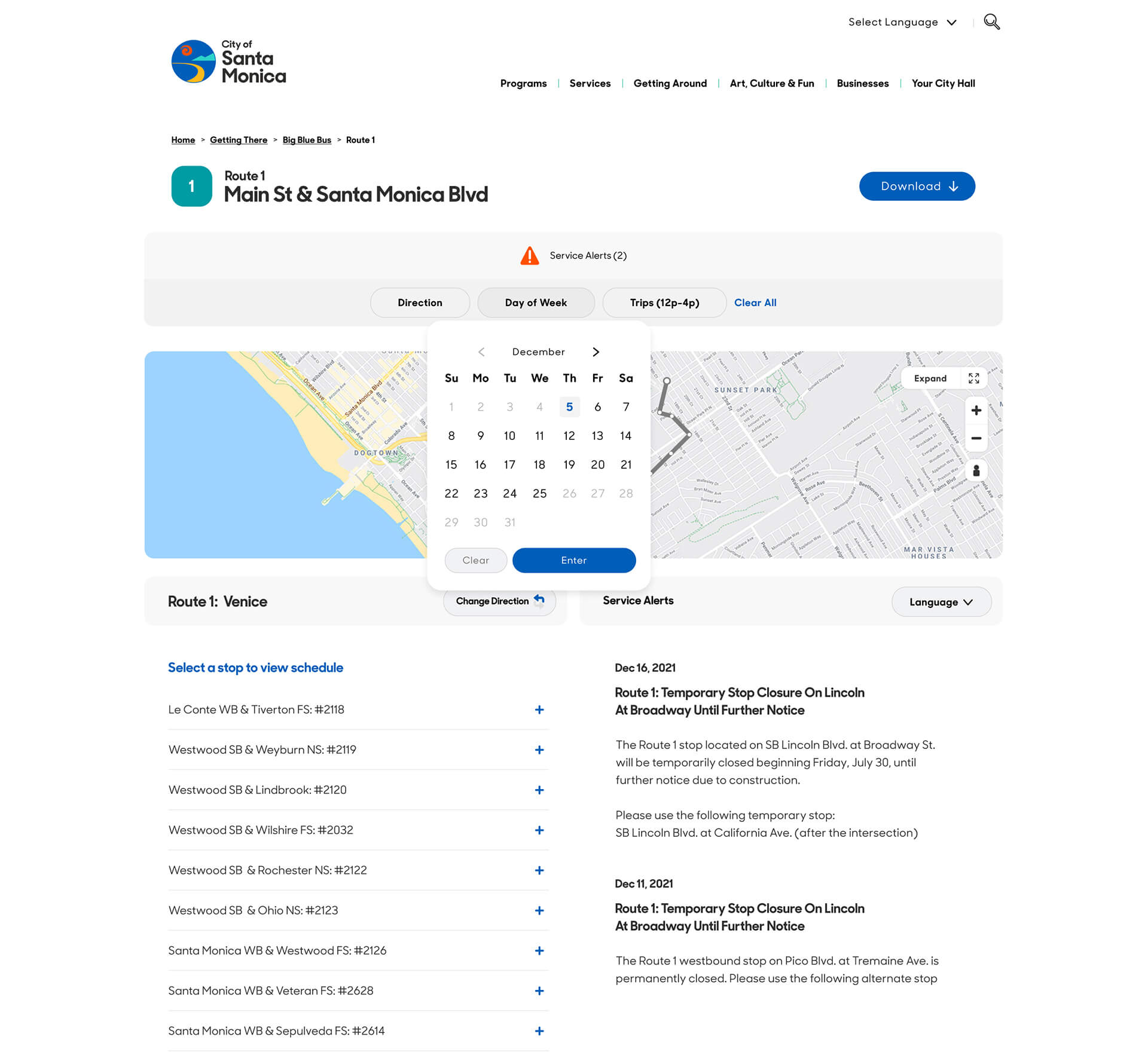
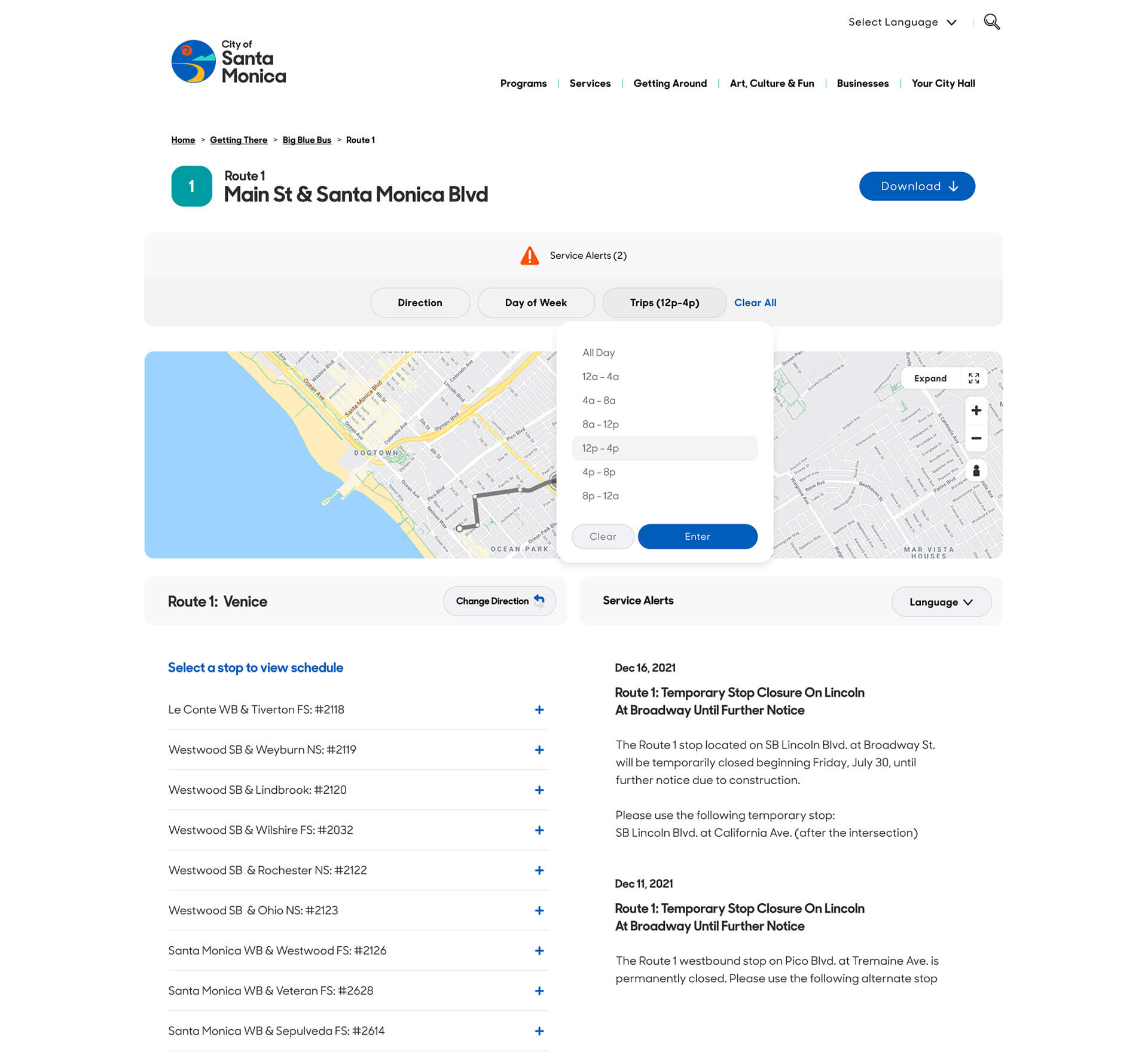
The proposed microsite featured a clean, mobile-first design centered around a live interactive map, allowing users to quickly locate buses and nearby stops. Branded in signature blues with high-contrast, the visual language of the experience focused on accessibility-first elements for inclusive use across all devices. Route cards were created to display live updates, ADA accessibility, and service alerts in real time.
A smart, swipe-friendly interface were kept in mind to ensure quick, confident decisions for riders of all ages, making public transit more reliable, visible, and rider-friendly. With multilingual support, smart notifications, and a user-centered layout, the microsite would empower riders to travel confidently, stay informed, and rely more easily on public transit.

primary
secondary
accent
warning


about (creativity). I'm excited to hear about any potential opportunities.
