To face the challenge of breaking through a crowded family entertainment market with limited awareness of this new, original title compared to well-established franchises, we needed to deliver a creative strategy that would capture attention, resonate with diverse audiences, and drive social engagement. Traditional promotional approaches risked blending into the noise, so the campaign required a distinctive visual identity and content strategy to spark excitement and build momentum across digital platforms.
Through interviews with participants, clients and stakeholders, we gathered valuable insights to better understand and empathize with the needs of our target audience. This allowed us to dive deeper into defining the project's challenges.
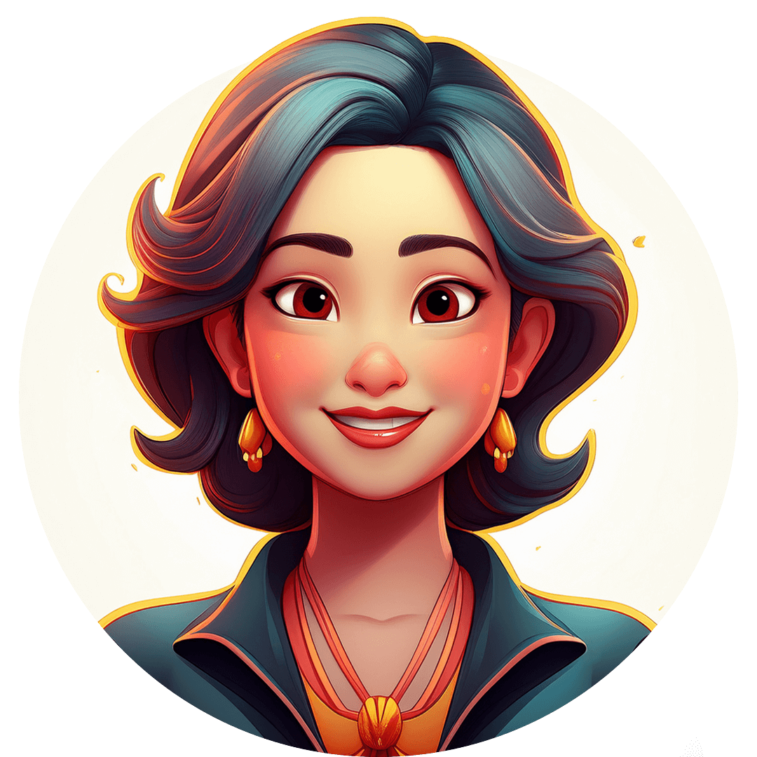
Family Movie Planner
Name: Angie
Age: 35
Parent looking for family-friendly entertainment that appeals to both kids and adults.
Goals:
• Find movies that are fun, age-appropriate
• Plan streaming nights that bring the family together.
• Access simple, easy-to-share content online
Motivations:
• Quality time with family.
• Stories that are lighthearted yet meaningful.
• A safe, wholesome entertainment choice.
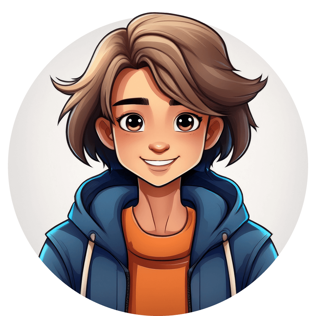
Young Animation Fan
Name: Alex
Age: 19
Teen who loves anime, manga, and stylized animated films.
Goals:
• Discover visually striking characters and moments.
• Enjoy food from local vendors and unique cuisines.
• Connect with friends and meet new people.
Motivations:
• Passion for unique animation styles and pop culture.
• Being part of an online fan community.
• Content that feels modern, expressive, and shareable.

Casual Moviegoer
Name: Matt
Age: 27
Young professional looking for weekend entertainment without brand loyalty.
Goals:
• See humor in short clips before committing.
• Enjoy easy-to-consume content while browsing.
Motivations:
• Convenience and low-effort decision-making.
• Entertainment that fits a busy lifestyle.
• Engaging visuals that spark curiosity.

Social Media Trend Seeker
Name: Emily
Age: 25
TikTok/Instagram creator always on the lookout for trending entertainment content.
Goals:
• Find visually creative content to repost or react to.
• Build audience engagement with shareable trends.
• Collaborate with brands or campaigns for visibility.
Motivations:
• Growing personal brand and online relevance.
• Being first to jump on pop culture moments.
• Content that is bold, fun, and visually catchy.
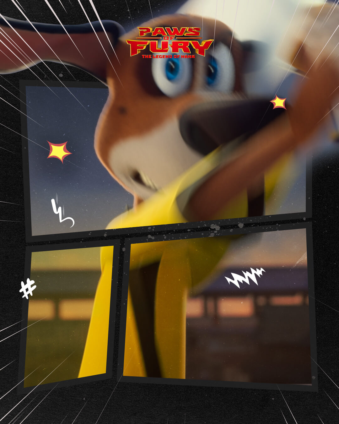
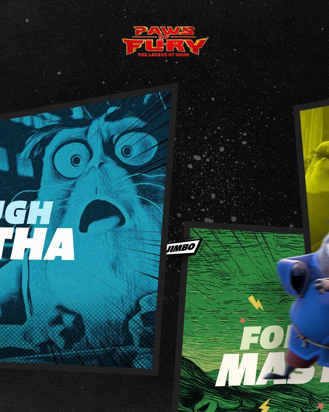
A motion test would serve as a proof of concept to validate how the anime/manga-inspired visuals translated into dynamic, shareable digital content. It focused on experimenting with character animation, transitions, and visual effects to ensure the campaign’s bold style resonates across social platforms.
To refine the balance between stylized anime flair and brand clarity, we aimed to visualize assets are that were eye-catching, legible, and engaging across multiple touchpoints before full-scale rollout.

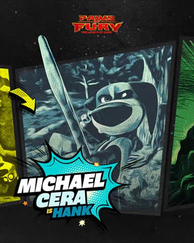
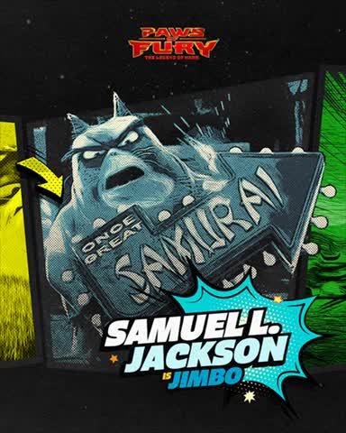
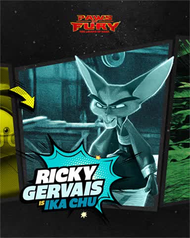
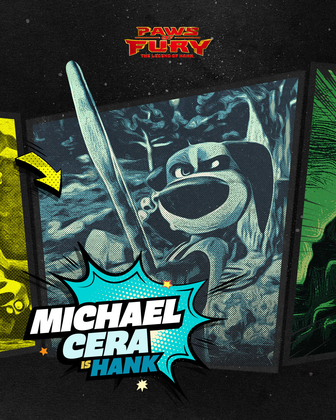
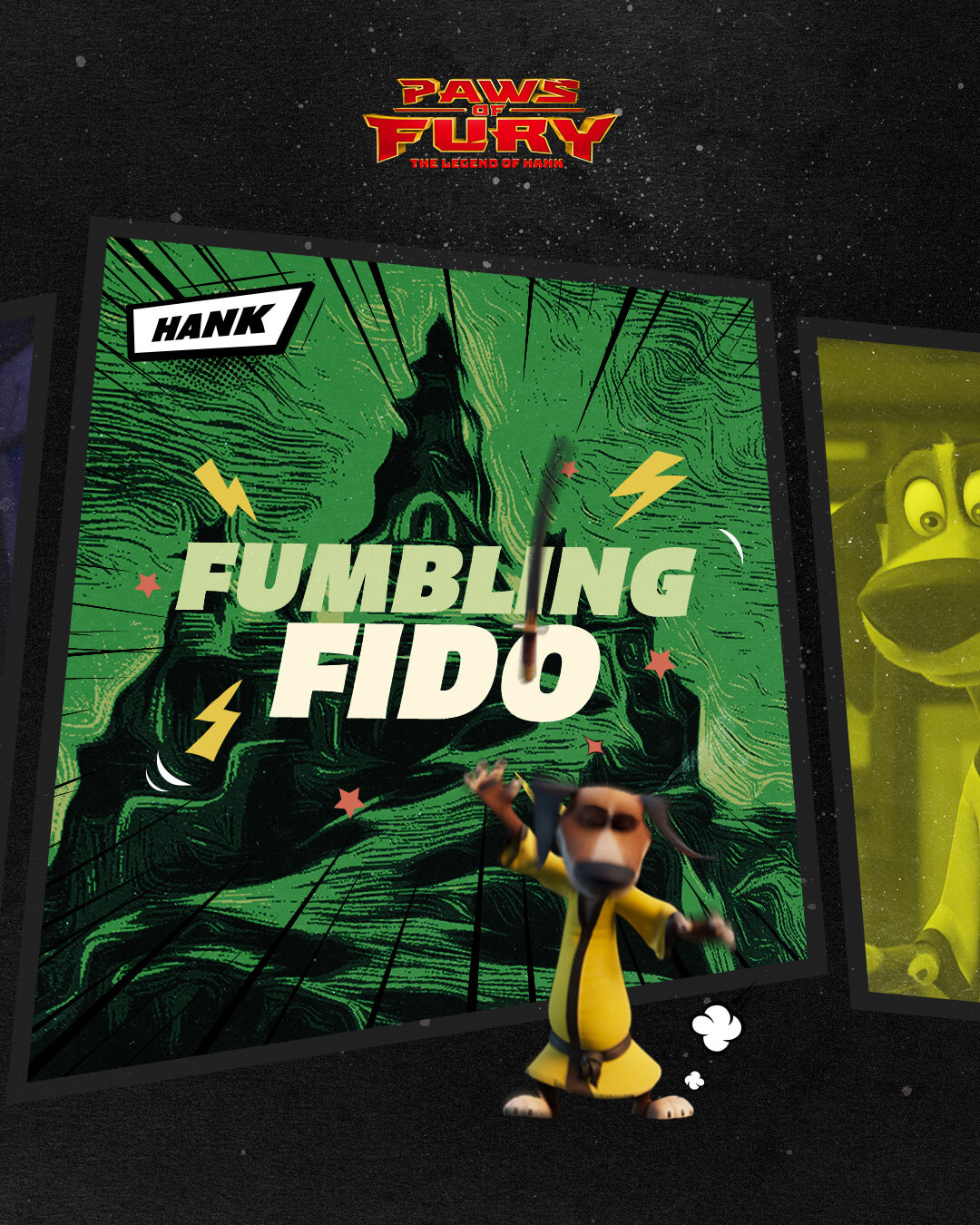
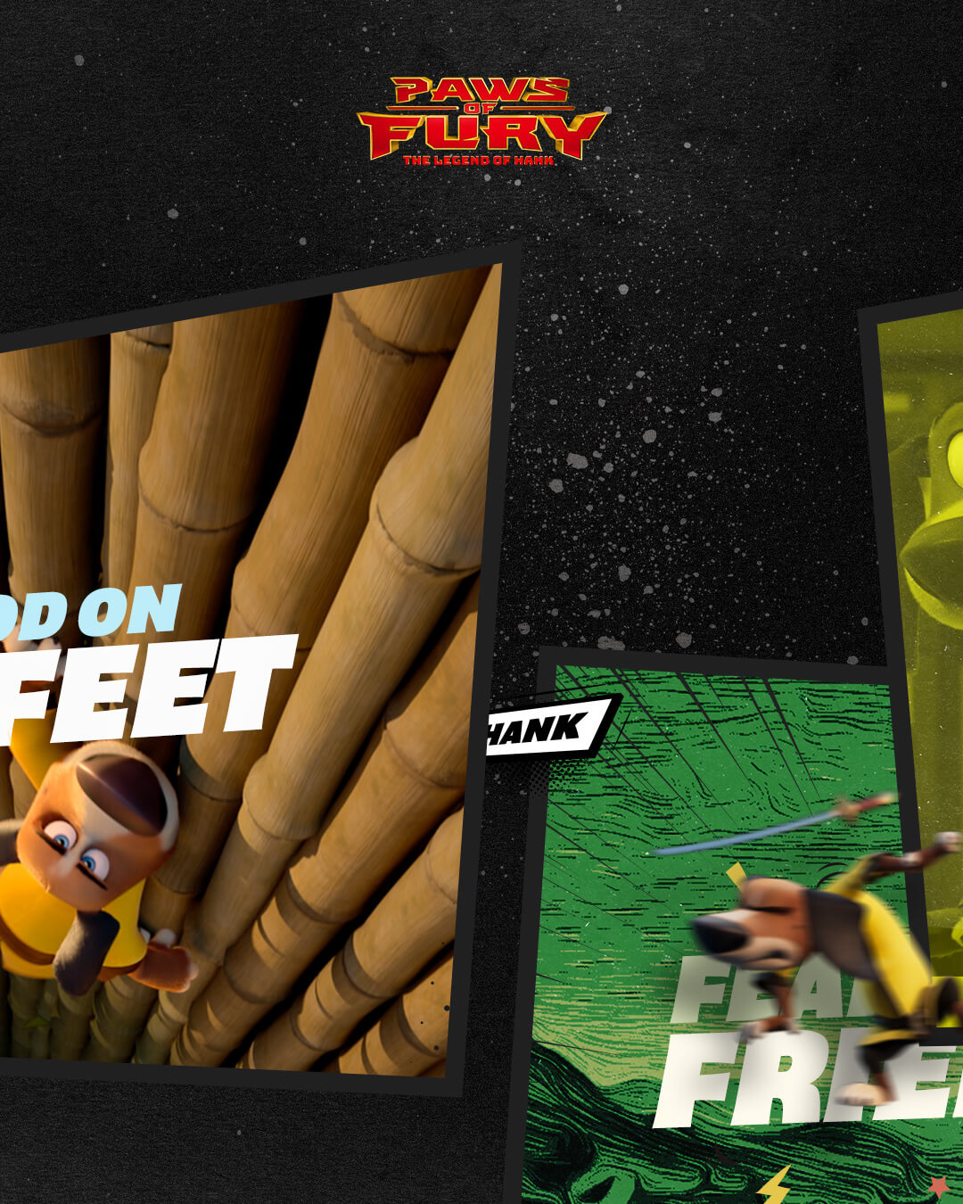
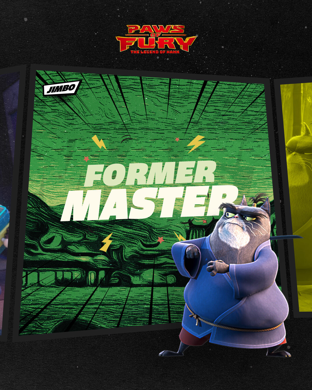
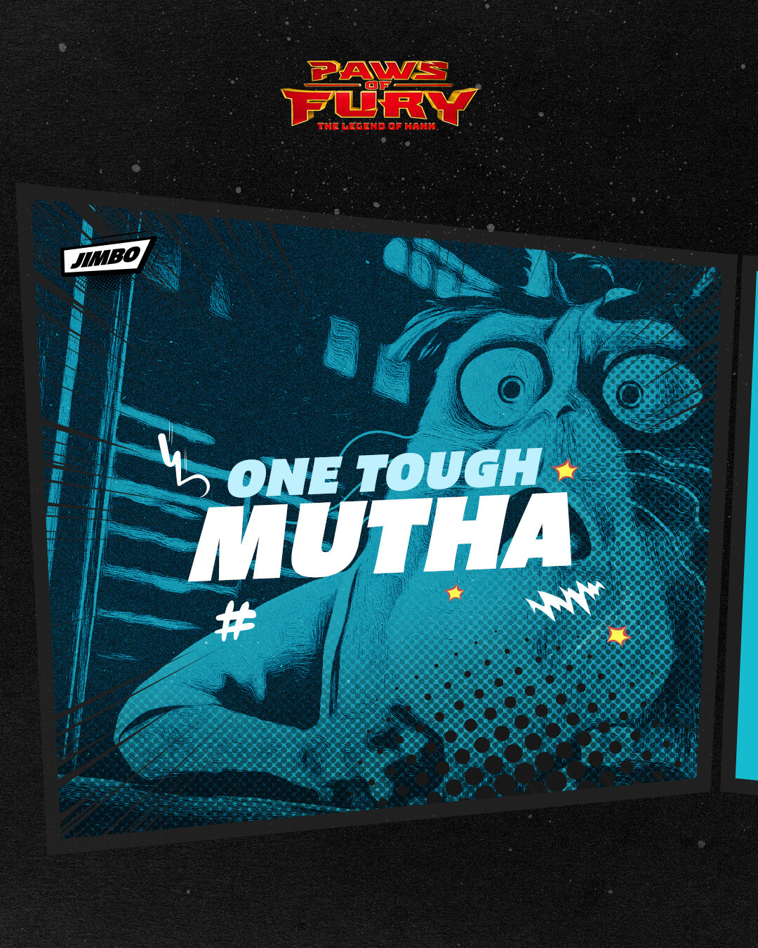
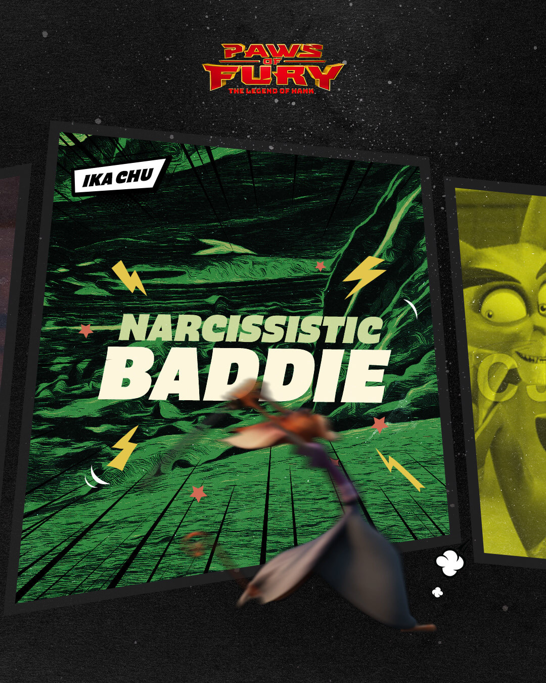
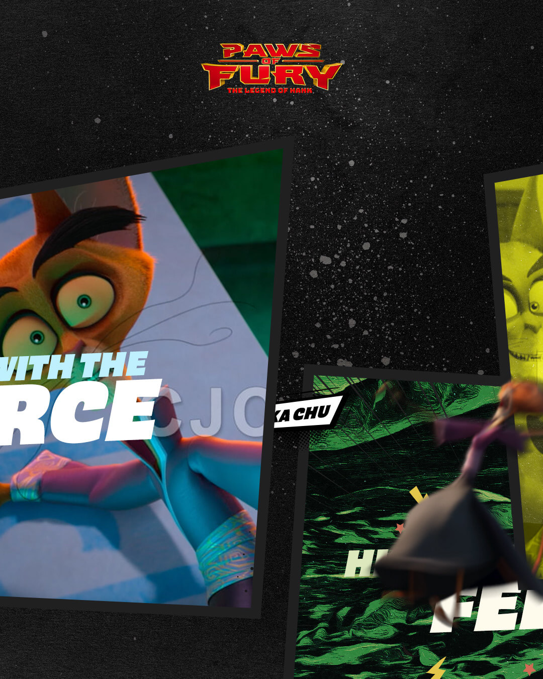
The visual design drew heavily from anime and manga influences, blending bold line work, exaggerated motion effects, and vibrant color palettes to create a style that stood apart from typical family film promotions.
Each character was highlighted through unique stylized treatments, while a unifying “hero asset” tied the campaign together. Typography was energetic and expressive, often echoing comic book or manga-inspired layouts, giving posts a sense of movement even in static form. The result was a playful yet polished aesthetic that reflected the film’s humor, action, and cultural nods, while being tailored for high engagement on social platforms.


about (creativity). I'm excited to hear about any potential opportunities.
