
Despite the rich history and wide appeal of the New York State Fair, it can be challenging to capture the attention of younger, digital-first audiences and sustain engagement beyond the event dates. The Fair needed a fun, accessible way to build excitement, educate the public, and drive both online and in-person participation in a way that resonates year-round.
Through interviews with clients and stakeholders, we gathered valuable insights to better understand and empathize with the needs their target audience may have along with addressing any potential pain points they may experience. This allowed us to dive deeper into defining the project's challenges.
Our team went through the process of rapidly visualizing, testing and refining thoughts and ideas before the development process. Below is a glimpse of how we defined our vision of the user's journey through the app by highlighting decision points, loops and any potential friction areas.

To help the team determine the priority of information, I designed the placement and layout of content in wireframe form which allowed for rapid iteration, feedback and discussions.
Once approved, I developed the wireframes into a working prototype to help simulate user interaction with the product and address any potential pain points discovered throughout the early stages.

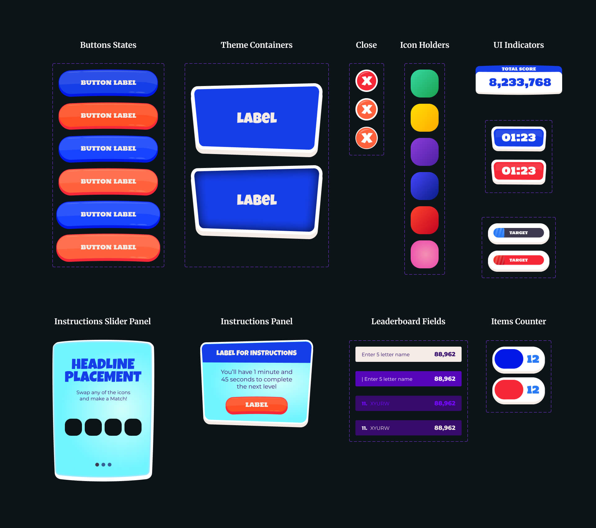
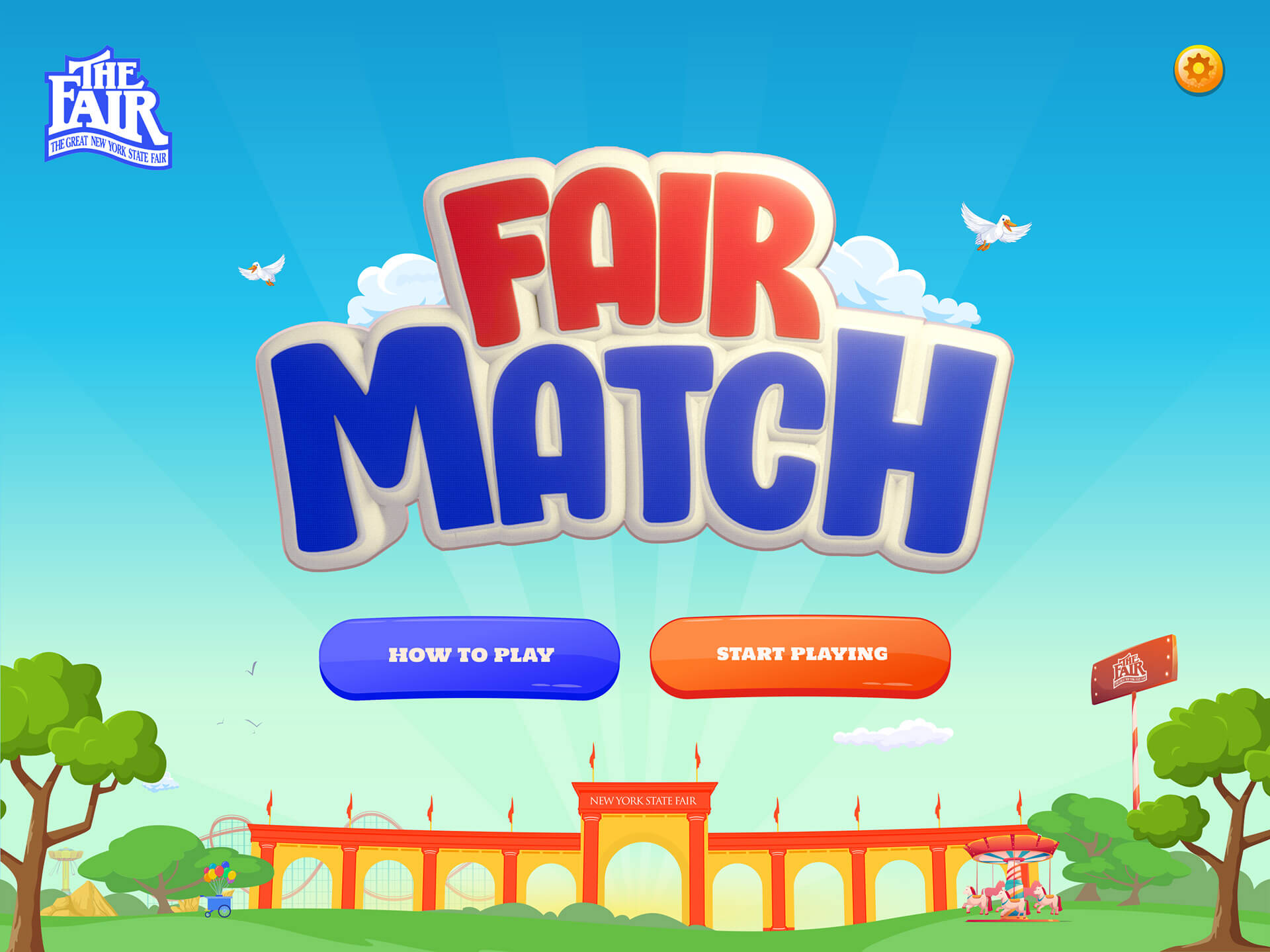
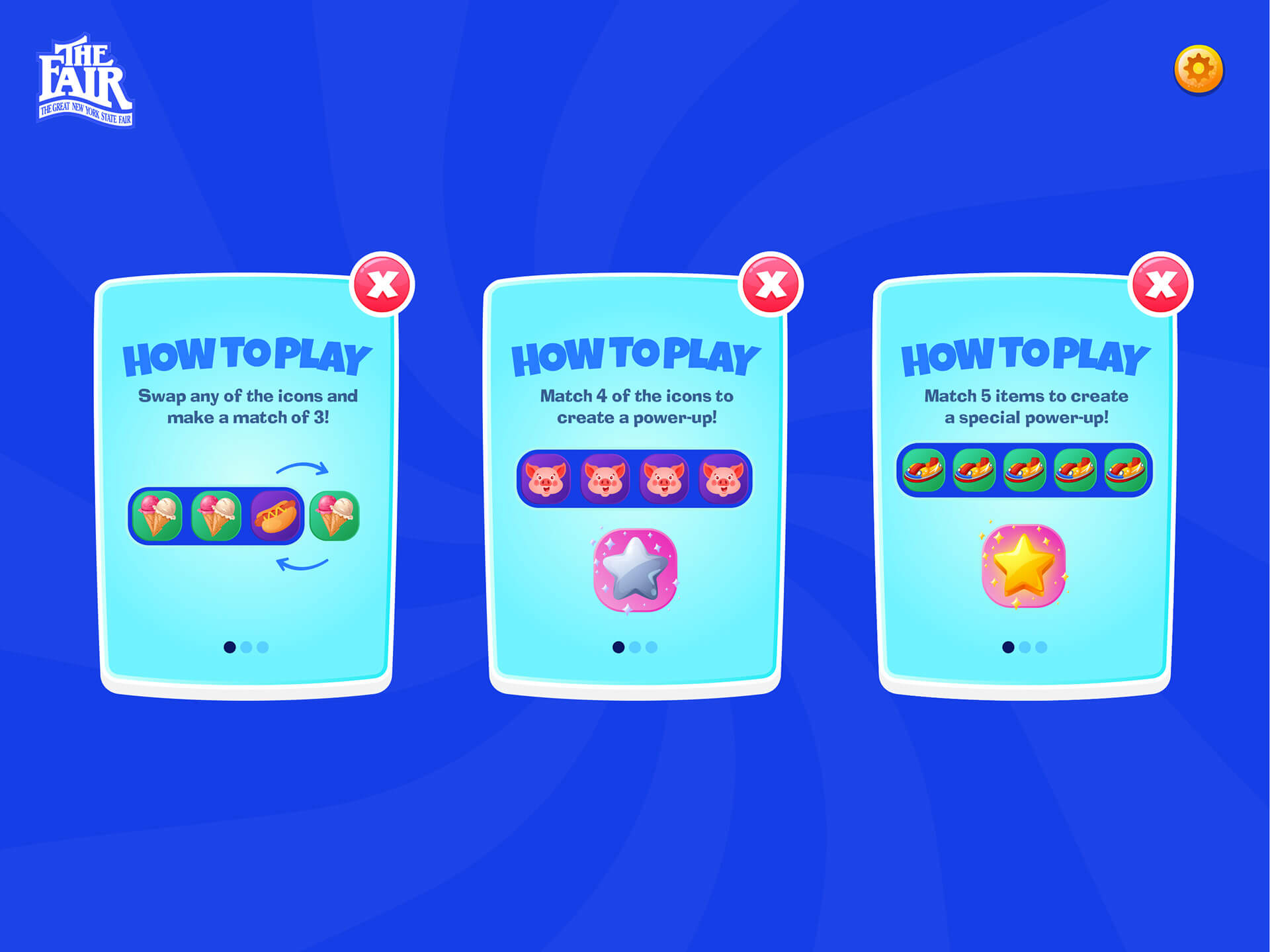
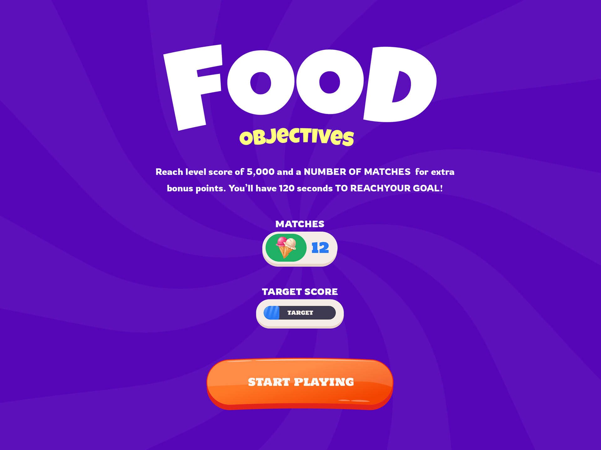
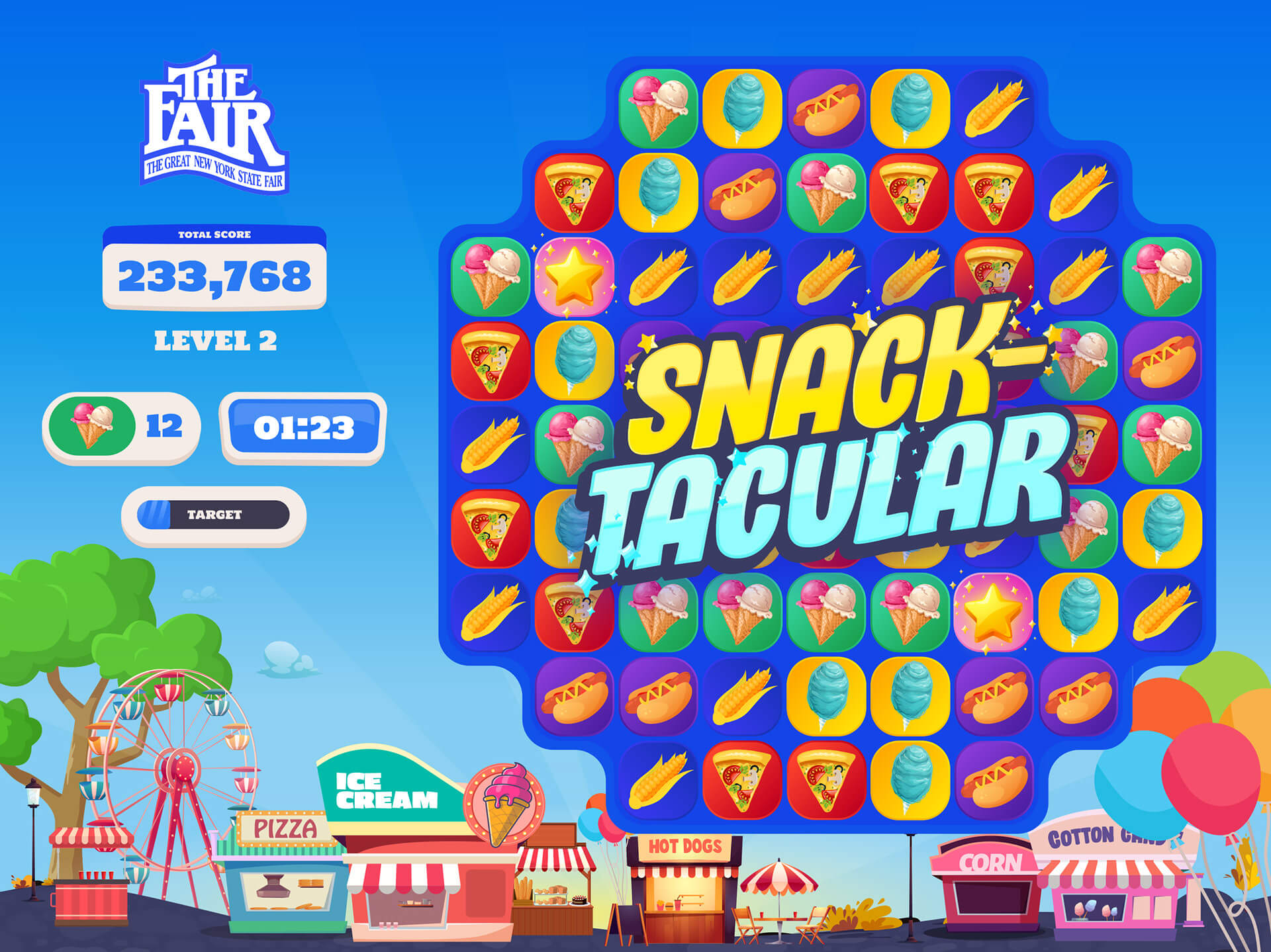
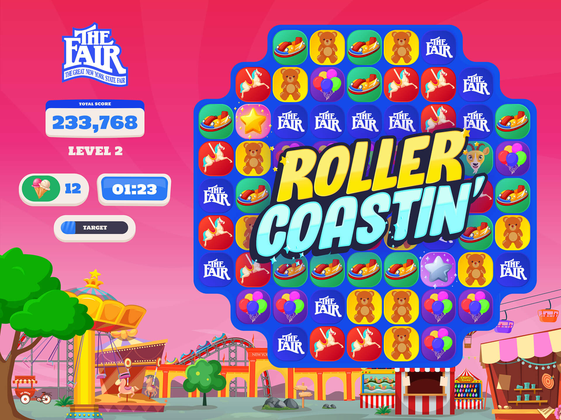
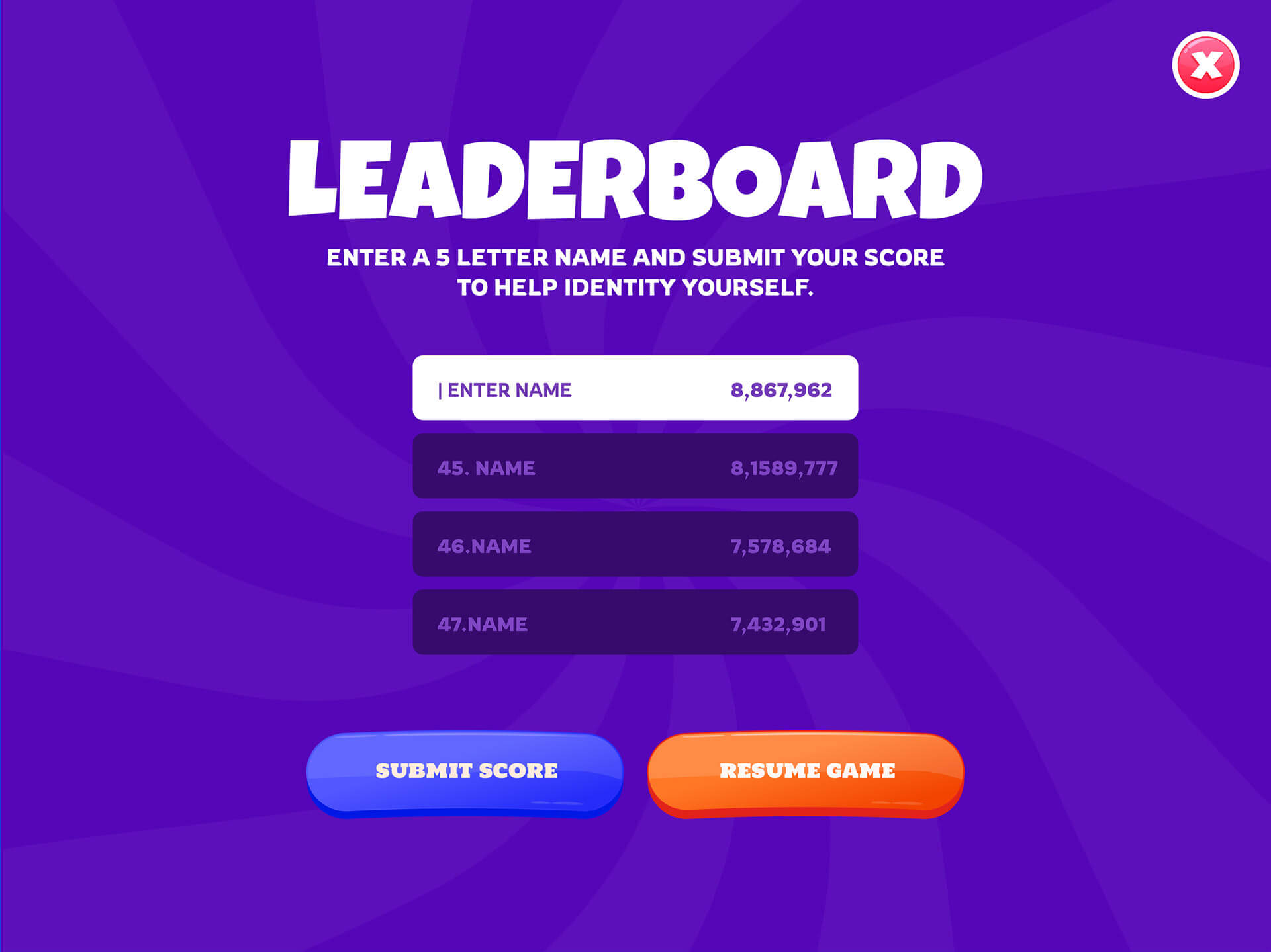
The Fair Match game featured a vibrant, playful visual style inspired by the charm of the state fair. Colorful icons—like corn dogs, cows, ribbons, and ride tickets—were utilized in a cheerful cartoon style with lively animations and celebratory effects. The interface uses bright, primary colors, rounded buttons, and fair-themed textures like wood signs and bunting.
Friendly fonts, glowing highlights, and whimsical sounds created an inviting atmosphere for all ages with backgrounds designed to depict a festive fairground. The visual system looked to balance fun and familiarity, making it perfect for families, kids, and casual players alike.


