
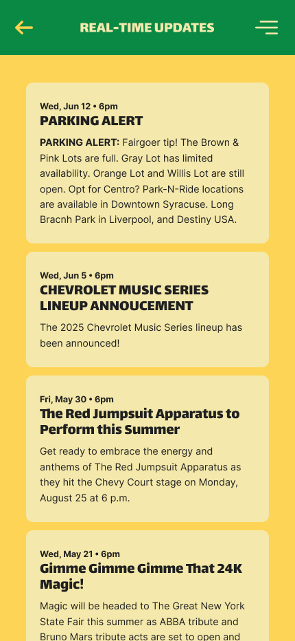
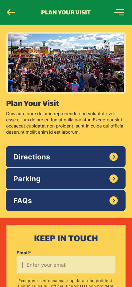
Visitors to the New York State Fair often face challenges navigating the large fairgrounds, keeping track of daily events, and finding food or entertainment that matches their interests. Traditional tools like printed maps and schedules are static and outdated, leading to missed experiences and confusion. A mobile app was needed to provide a centralized, real-time solution for discovering events, navigating the fair, and planning a personalized visit.
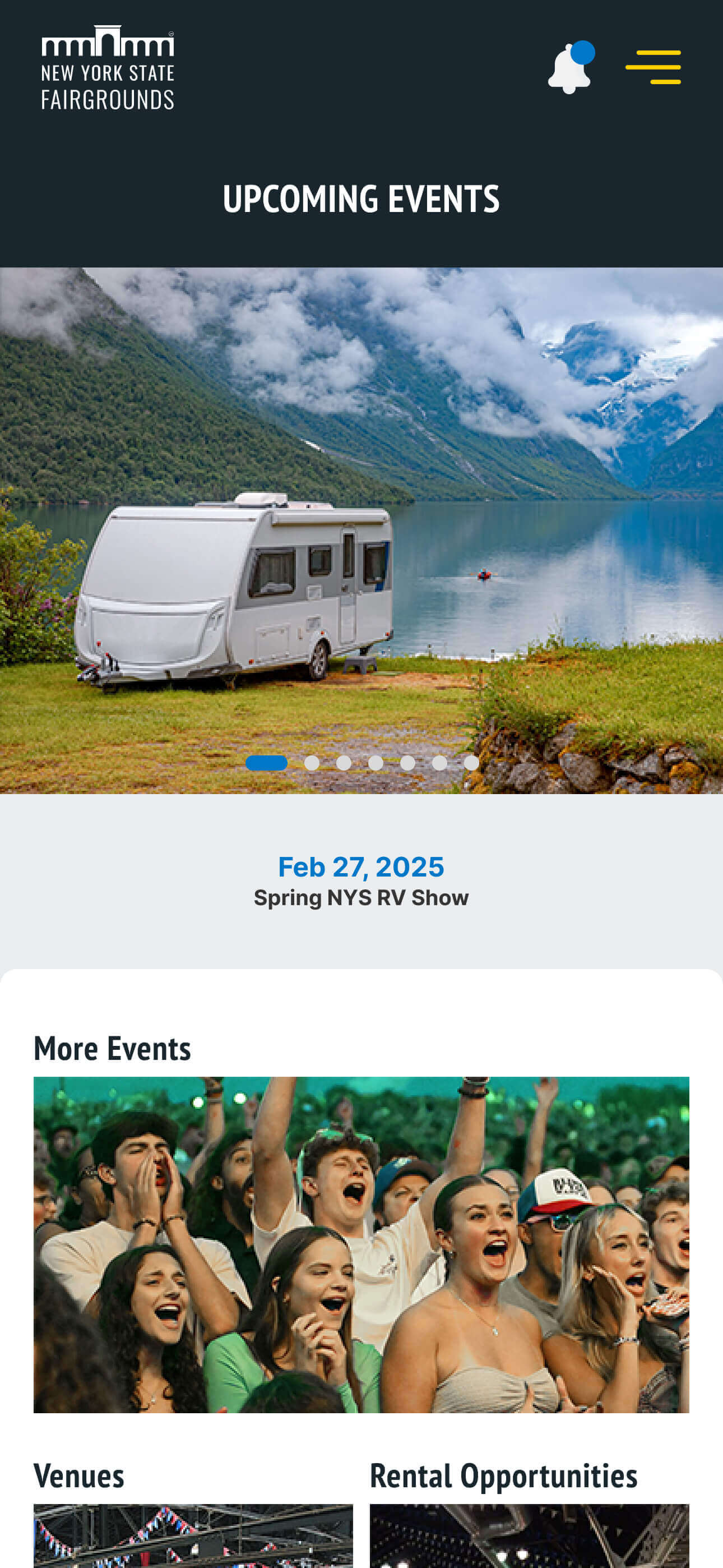
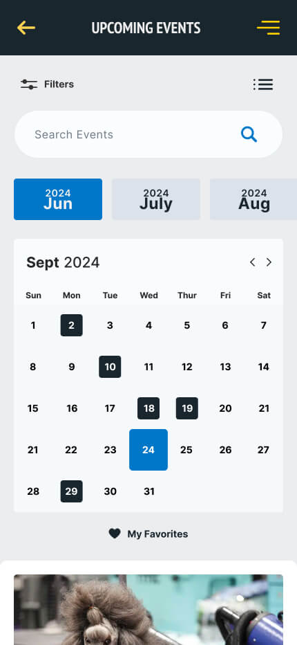
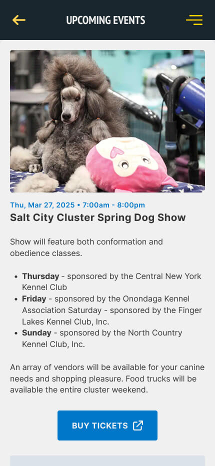
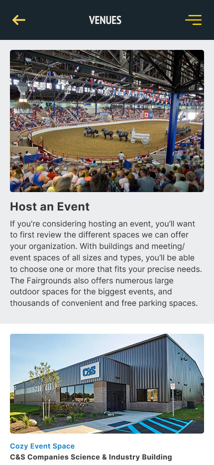
We designed a mobile app that helped visitors easily navigate the fairgrounds, discover events and food options tailored to their interests, and stay informed through real-time updates—making their experience more enjoyable, personalized, and stress-free.
Through interviews with participants, clients and stakeholders, we gathered valuable insights to better understand and empathize with the needs of our target audience. This allowed us to dive deeper into defining the project's challenges.

Family Fun Seeker
Name: Sarah Johnson
Age: 35
Location: Syracuse, NY
Family: Married with two children (ages 7 and 10)
Tech Comfort Level: Moderate
Goals & Motivations:
• Provide a fun, educational experience for her children.
• Find family-friendly activities and attractions.
• Enjoy local food and crafts.
Needs from the Experience:
• Exploring educational exhibits related to agriculture.
• Engage in hands-on activities with her kids.
• Create lasting memories with her family.

Young Adult Adventurer
Name: Mike
Age: 25
Location: Brooklyn, NY
Family: Single
Tech Comfort Level: High
Goals & Motivations:
• Discover new music and entertainment acts.
• Enjoy food from local vendors and unique cuisines.
• Connect with friends and meet new people.
Needs from the Experience:
• Experience the vibrant culture of the fair.
• Share moments on social media and capture experiences.
• Participate in late-night events and concerts.

Senior Culture Enthusiast
Name: Margaret
Age: 68
Location: Rochester, NY
Family: Widowed, enjoys time with grandchildren
Tech Comfort Level: Low
Goals & Motivations:
• Appreciate local art, culture, and heritage.
• Engage in light activities and demonstrations.
• Attend workshops or lectures related to crafts or cooking.
Needs from the Experience:
• Rediscover the joy of local traditions and community.
• Connect with other seniors and share experiences.
• Enjoy leisurely strolls through the fair.

The Casual Viewer
Name: Jordan
Age: 25
Location: Albany, NY
Family: Single
Tech Comfort Level: High
Goals & Motivations:
• Discover the concert lineup, set reminders for shows
• Explore unique food vendors and try something new
• Share his experience on social media in real-time
Needs from the Experience:
• A searchable concert schedule with genre filters
• Ability to save shows and get push reminders
• Real-time vendor updates (e.g., popular items, long lines)
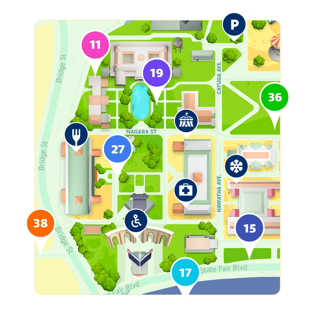
Our team went through the process of rapidly visualizing, testing and refining thoughts and ideas before the development process. Below is a glimpse of how we defined our vision of the user's journey through the app by highlighting decision points, loops and any potential friction areas.
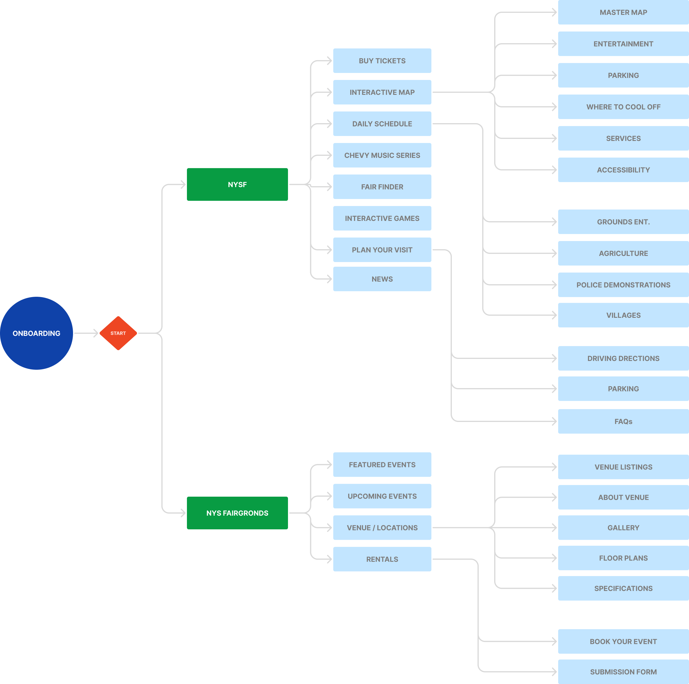
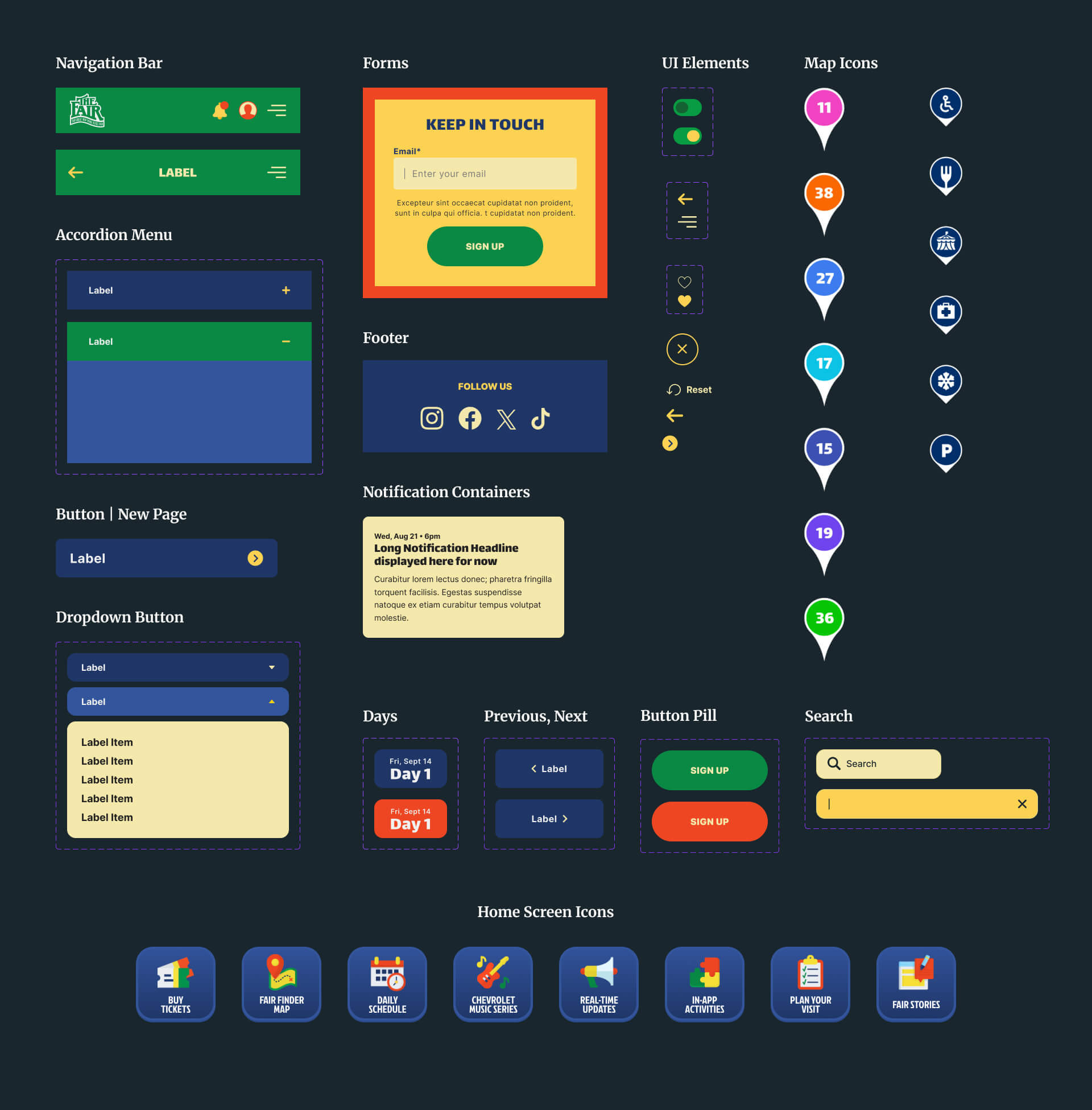
To help the team determine the priority of information, I designed the placement and layout of content in wireframe form which allowed for rapid iteration, feedback and discussions about the product.
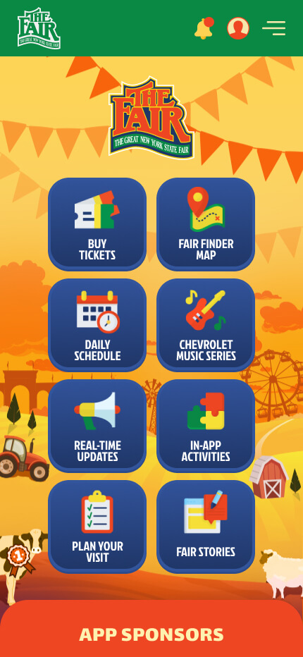
Once approved, I developed the wireframes into a working prototype to help simulate user interaction with the product and address any potential pain points discovered throughout the early stages.

We looked to create a visual language that reflected both the heritage of agriculture and the festive, diverse spirit of the fair while honoring the brand's color system. Our goal was to evoke a sense of nature using organic color palettes and imagery depicting healthy produce, livestock and design elements that create a strong brand expression for the agricultural landscape.
In regards to typography, we focused on a system that compliments the concepts of fun, family-friendly and legibility. The major second type scale allowed for subtle, conservative contrast between text elements, suitable for mobile apps.


about (creativity). I'm excited to hear about any potential opportunities.
