
DreamWorks Animation needed a digital platform for Gabby’s Dollhouse that could engage a global preschool audience while also meeting the needs of parents and caregivers. The challenge was to design a website that captivates young children (ages 4–8) with simple, interactive, and visually rich content and supports multilingual access without relying on heavy reading or text.
The site needed to strike a balance between playful immersion for kids and functional efficiency for parents, teachers, and content managers, all while reflecting the imaginative spirit of the Gabby’s Dollhouse brand.
Through interviews with participants, clients and stakeholders, we gathered valuable insights to better understand and empathize with the needs of our target audience. This allowed us to dive deeper into defining the project's challenges.

The Imaginative Fan
Name: Sophie
Age: 7
Location: Brooklyn, NY
Language English
Device: Personal tablet (Amazon Fire Kids Edition)
Goals & Motivations:
• Explore characters and playing themed games
• Watch music videos and sing along with her favorite songs
• Easy-to-use navigation with visual cues
Needs from the Site:
• An engaging, colorful interface that feels magical and interactive
• Games that are slightly more complex than tap-to-play
• Clear breakdown of non-invasive screening options

The Supportive Parent
Name: Maria,
Age: 35
Location: Mexico City, MX
Language: Spanish
Device: Shared family phone
Goals & Motivations:
• Find kid-friendly, trustworthy content
• Print out downloadable activities for screen-free fun
• Occasionally browse Gabby merchandise as gifts
Needs from the Site:
• A version of the site in native language
• Clear indicators of age-appropriate and safe content
• Ability to navigate quickly between sections

The Tech-Savvy Sibling
Name: Luc
Age: 7
Location: Lyon, France
Language: French
Device: Desktop at home
Goals & Motivations:
• Challenge himself with puzzle and matching games
• Explore music and videos related to the show
• Share fun things with his younger sister
Needs from the Site:
• Games that feel a little more challenging, yet still intuitive
• Easy access to multimedia without long load times
• Navigation that works well on a bigger screen

The Preschool Teacher
Name: Ms. Thomas
Language: English
Device: Classroom Smartboard
Goals & Motivations:
• Use Gabby-related music and games for in-class activities
• Print worksheets and coloring pages for her students
• Keep students engaged with content that reinforces basic skills
Needs from the Site:
• Printable resources that are easy to find and download
• Simple, fun digital experiences that work well with classrooms
• Content free from ads or distractions
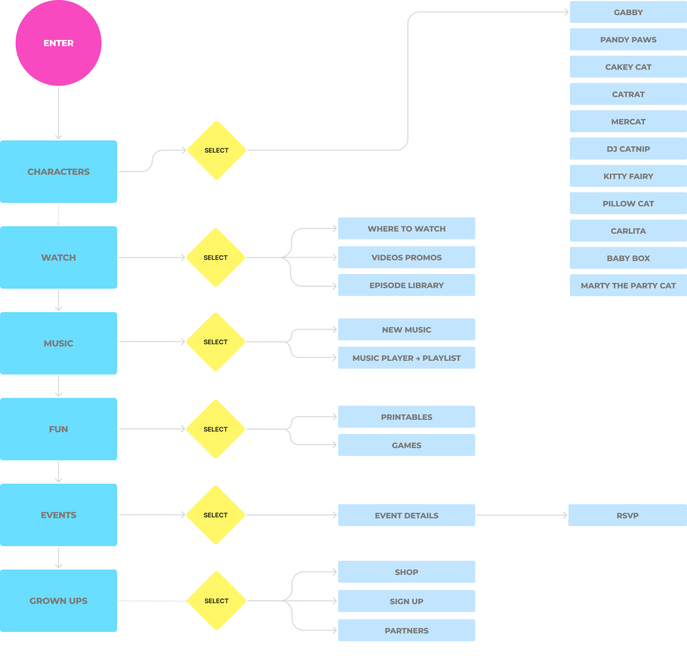
Our team went through the process of rapidly visualizing, testing and refining thoughts and ideas before the development process. Below is a glimpse of how we defined our vision of the user's journey through the app by highlighting decision points, loops and any potential friction areas.
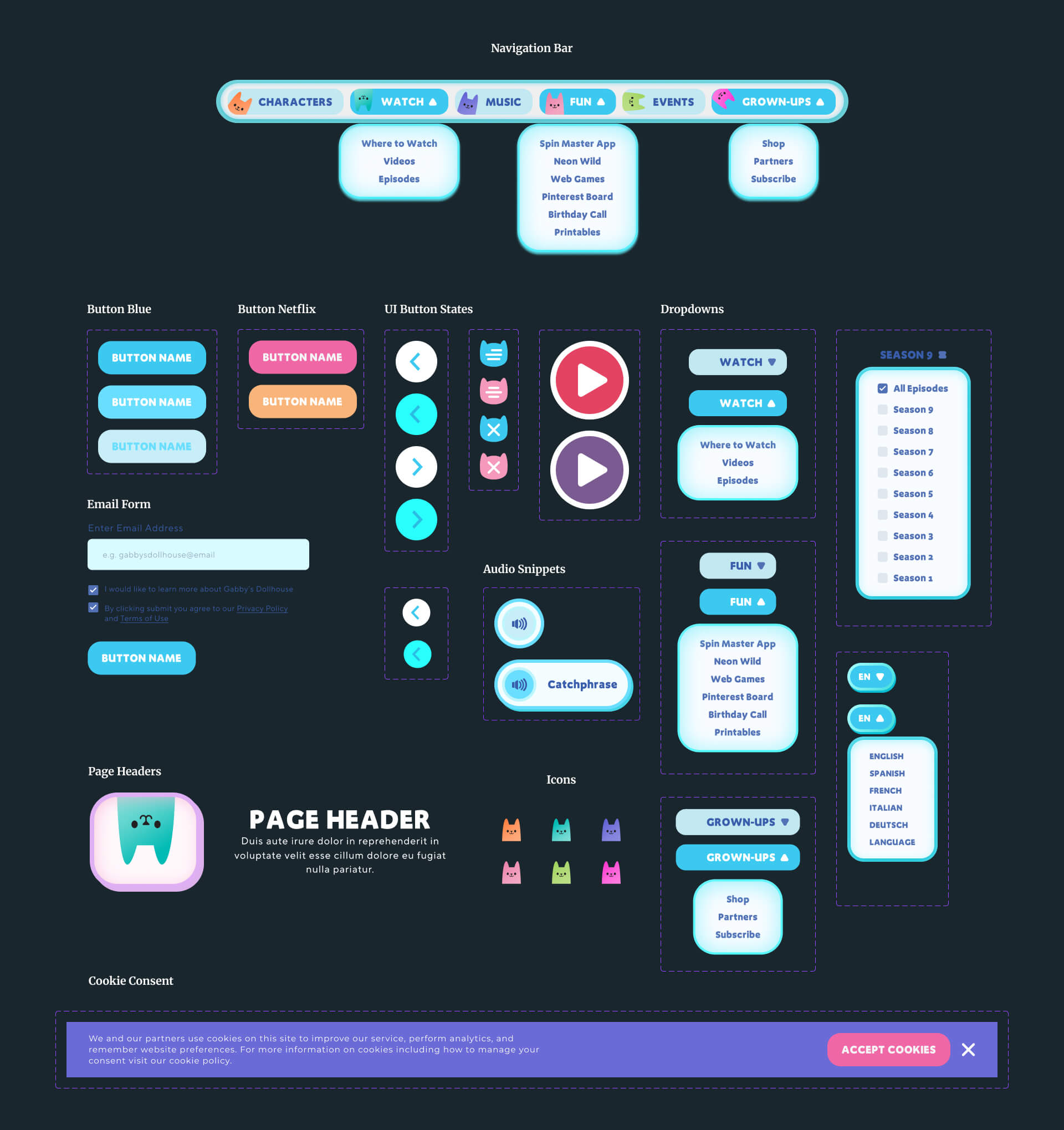
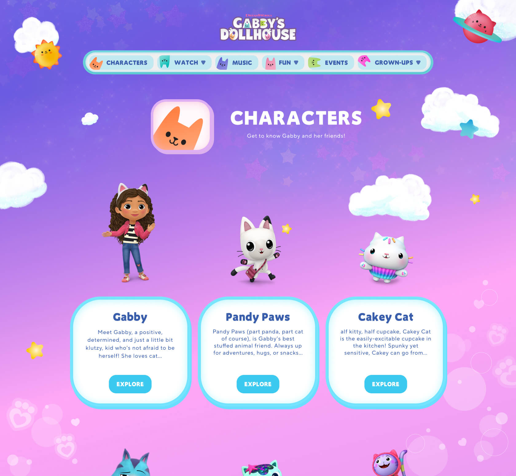
To help the team determine the priority of information, I designed the placement and layout of content in wireframe form which allowed for rapid iteration, feedback and discussions.
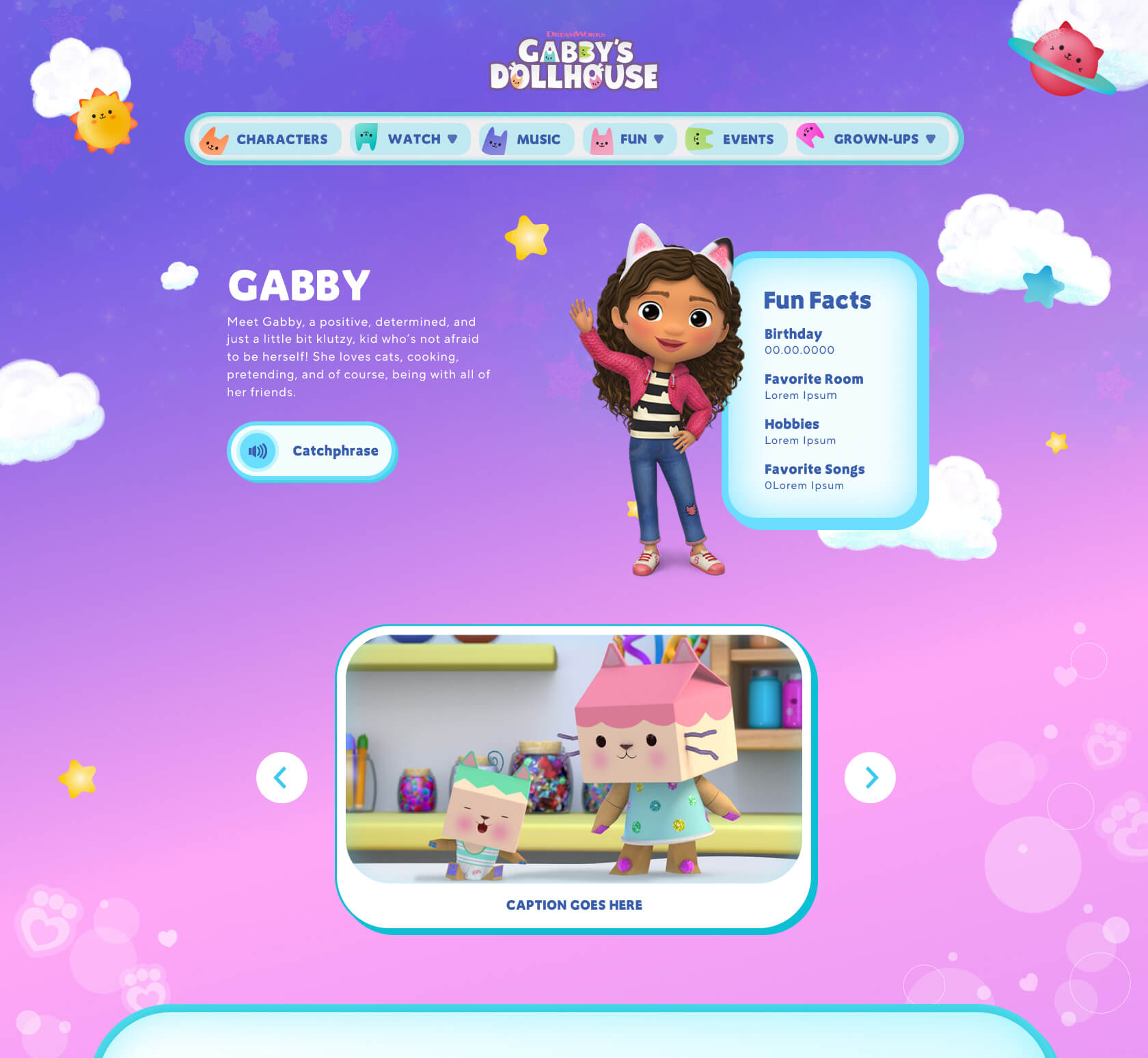
Once approved, I developed the wireframes into a working prototype to help simulate user interaction with the product and address any potential pain points discovered throughout the early stages.
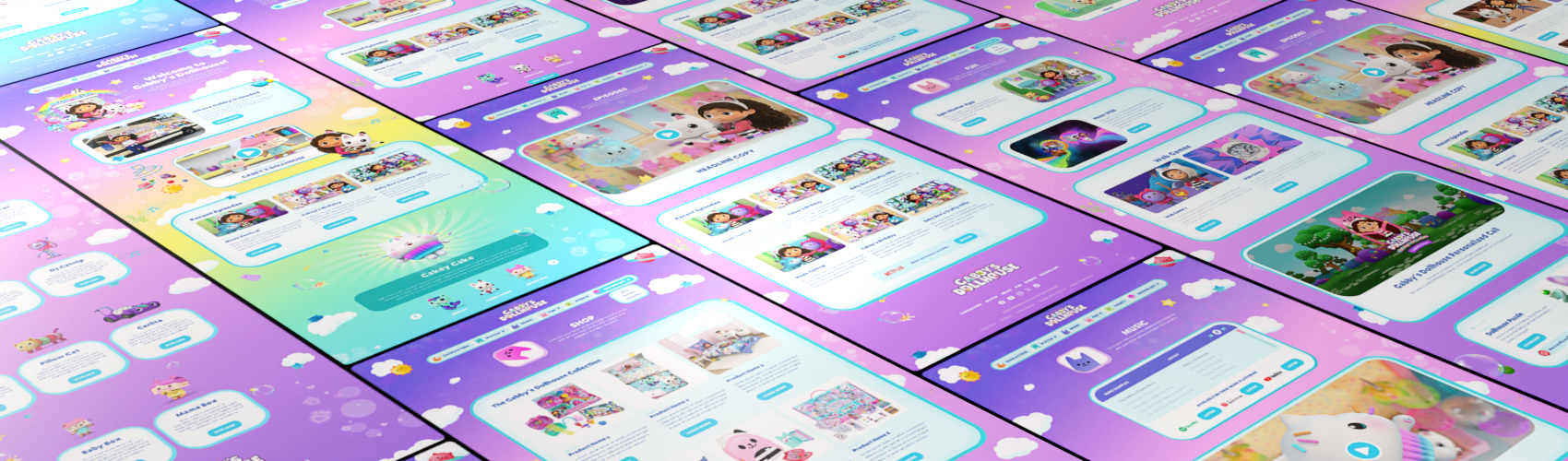
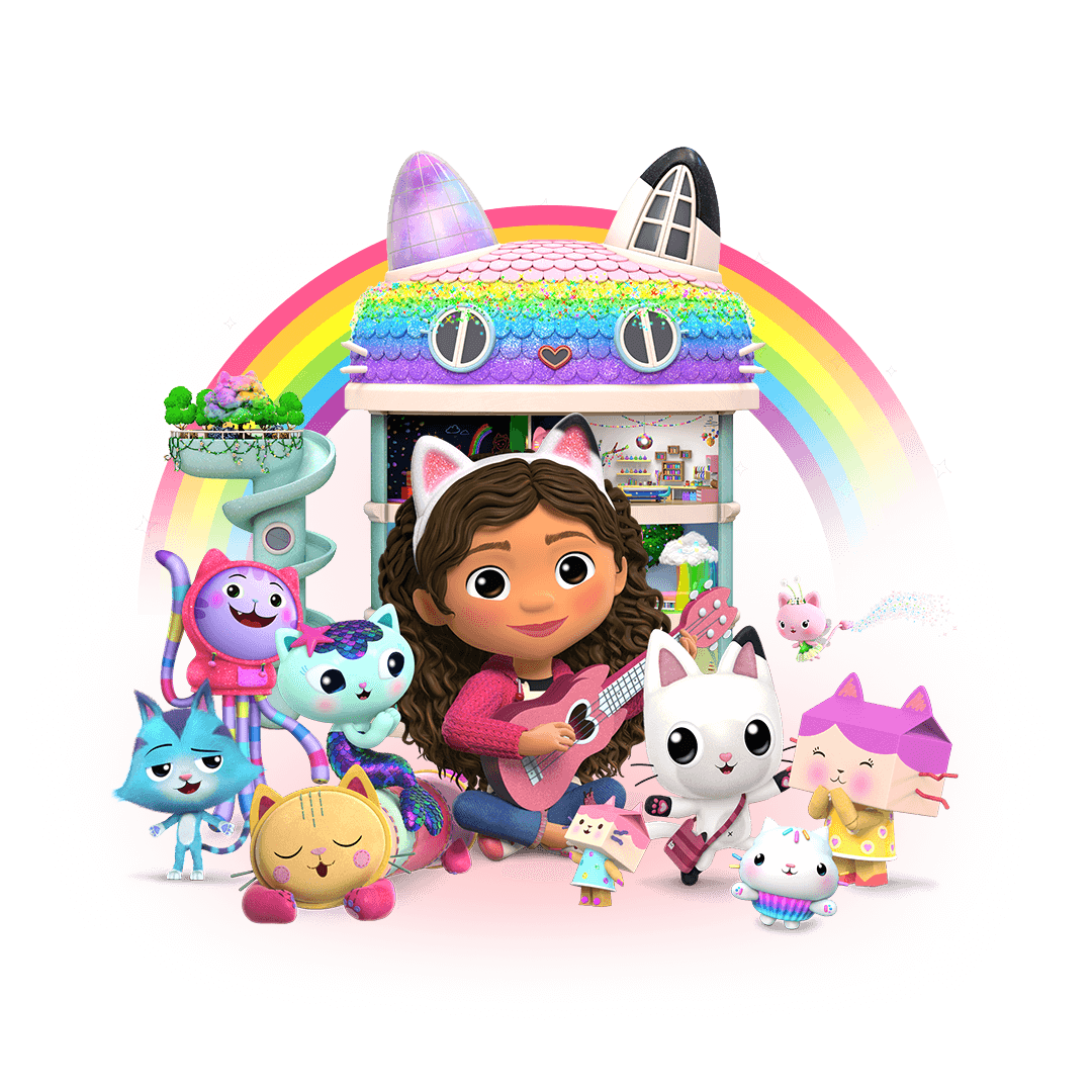
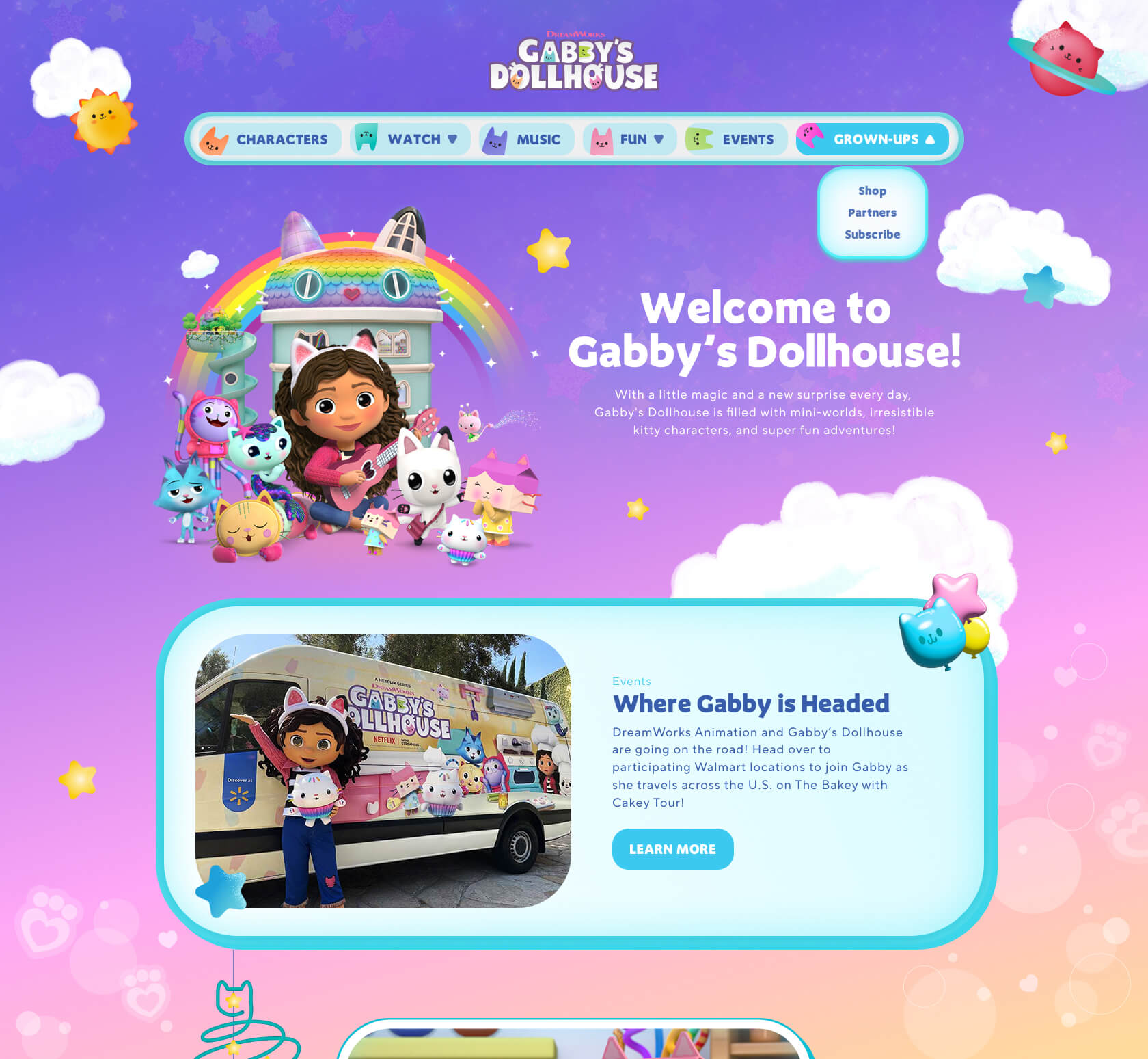
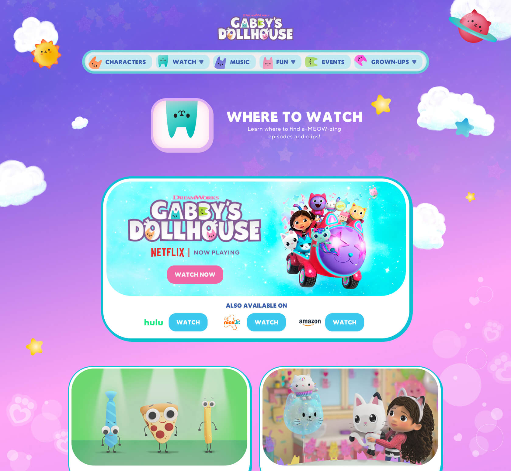
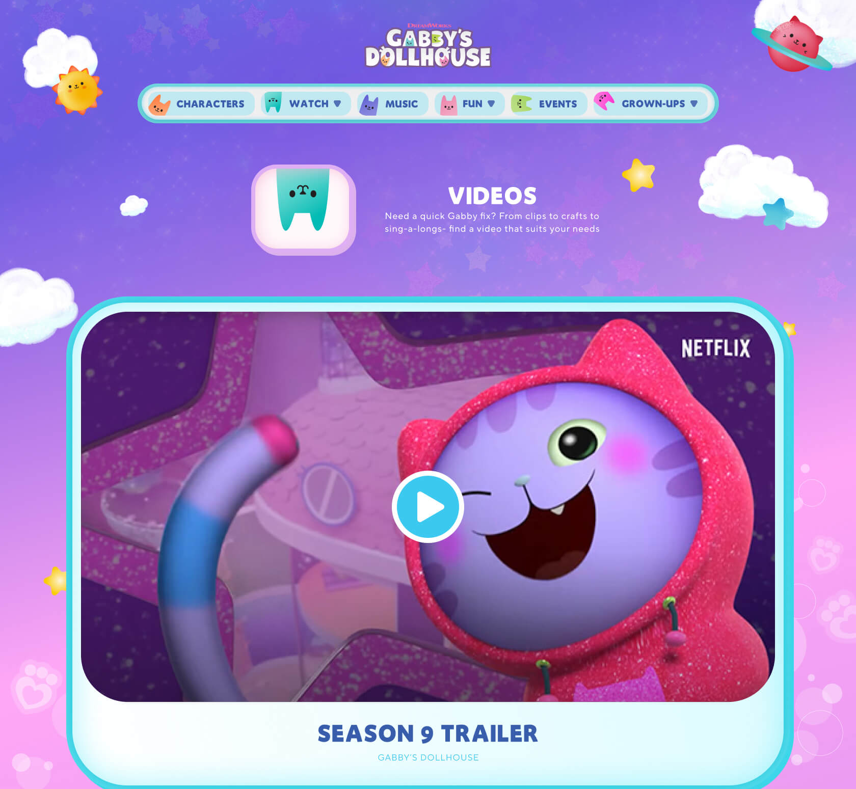
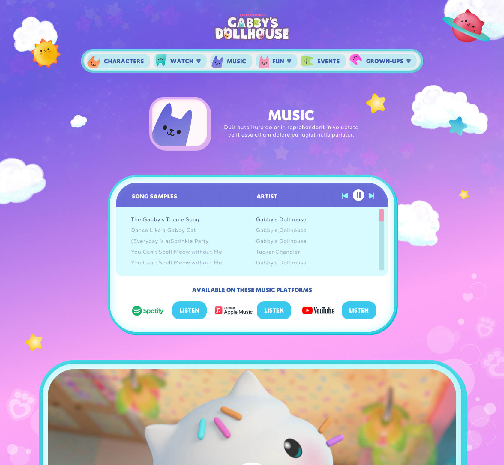
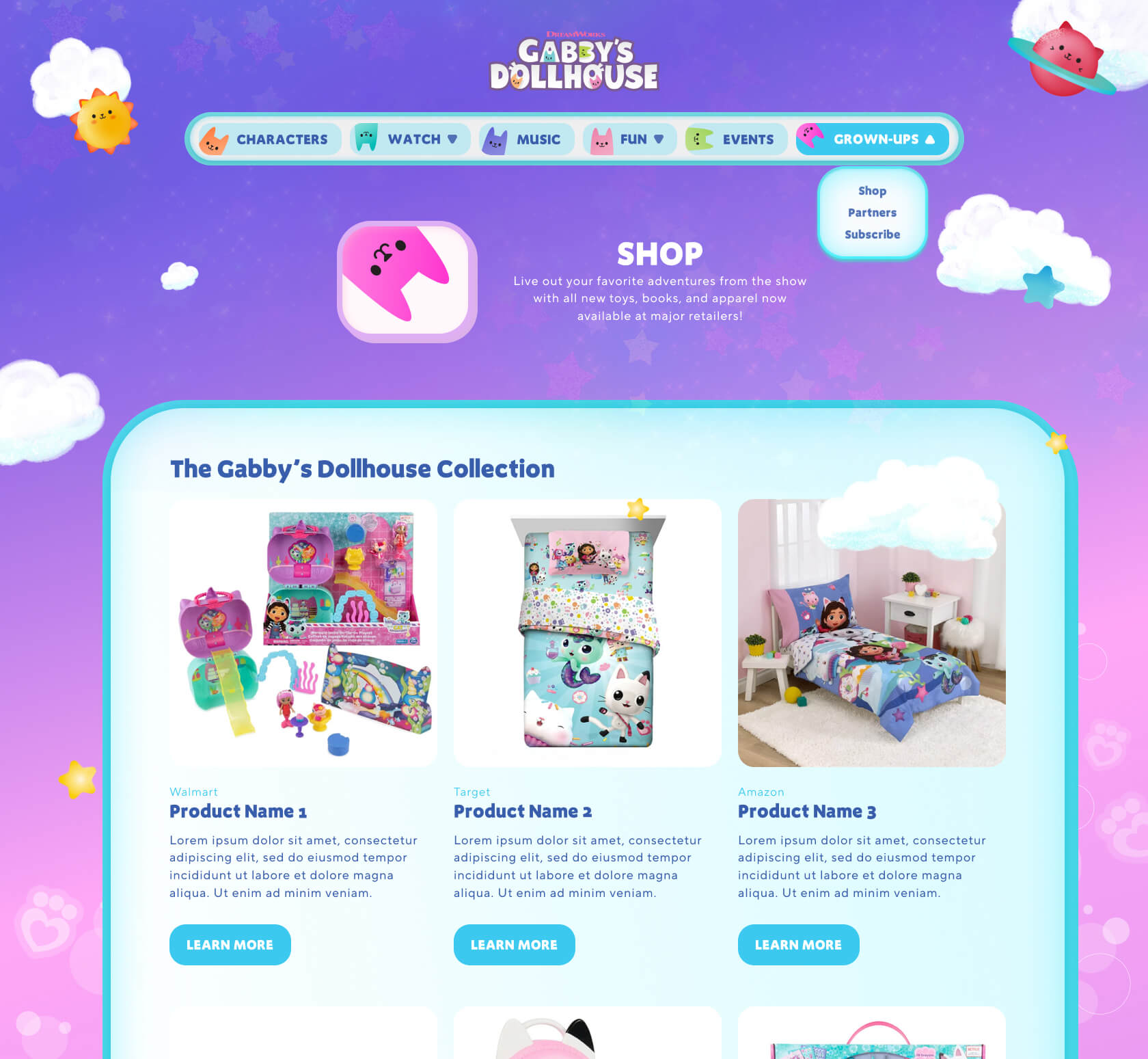
The Gabby’s Dollhouse website features a whimsical, pastel-toned design with playful animations, bold iconography, and rounded shapes that mirror the show’s magical, dollhouse-inspired world. We made each section feel like a colorful room, inviting kids to explore through large tappable visuals.
The interface balances fun and function, offering intuitive navigation for children while maintaining clarity and trust for parents. Responsive and accessible, the site delivers a bright, immersive experience across devices and languages.


about (creativity). I'm excited to hear about any potential opportunities.
